The Victoria HarbourCats are roughly half way through their inaugural season in the West Coast League, and currently lead the league in average attendance. In a recent conversation with one of the team's staff, he mentioned that after the first game in early June, the fans started to come out when the sun appeared and the weather got warmer.
In spite of the very small sample size, this question presented an opportunity to teach myself how to create a scatter plot matrix in R.
The first step was to get the necessary data fields from the HarbourCats website, pulling attendance, temperature, and other information from the box score for each home game. (Here's the box score for the team's first game, played on June 5, 2013.)
I entered the day of the week, and then coded them into 1 = Monday - Thursday, 2 = Sunday, and 3 = Friday & Saturday. I also thought whether it was a day game or played in the evening might matter, so I coded them as 0 = afternoon and 1 = evening (but so far, the only day games have been the two Sunday games). The amount of sun in the sky was taken from the description in the box score, and coded as 1 = cloudy, 2 = mostly cloudy, 3 = partly cloudy, 4 = mostly sunny, and 5 = sunny. I entered the temperature as both Celsius and Fahrenheit, and made additional notes about the game such as opening night. And finally, there's a variable "num" which is the number of the game (e.g. 15 is the 15th home game of the season.) The data table is here (Google drive).
First up was to run a quick line plot, to look at the variation in attendance as the season has progressed.
# ######################
# HARBOURCATS ATTENDANCE
# ######################
#
# data: pulled from www.harbourcats.com
# saved on Google Drive:
# https://docs.google.com/spreadsheet/ccc?key=0Art4wpcrwqkBdHZvTUFzOUo5U3BzMHFveXdYOTdTWUE&usp=sharing
# File / Download as >> Comma Separated Values (CSV)
#
# read the csv file
HarbourCat.attend <- read.csv("HarbourCat_attendance - Sheet1.csv")
#
# load ggplot2
if (!require(ggplot2)) install.packages("ggplot2")
library(ggplot2)
#
#
# #####
#
# simple line plot of data series
#
ggplot(HarbourCat.attend, aes(x=num, y=attend)) +
    geom_point() +
    geom_line()+
    ggtitle("HarbourCats attendance \n2013 season") +
    annotate("text", label="Opening Night", x=3, y=3050, size=3,
      fontface="bold.italic")
#
As the plot shows, opening night was an exceptional success, with just over 3,000 baseball fans turning up to see the HarbourCats take the field for the first time. For the purpose of this analysis, though, it's an extreme outlier and (particularly because of the extremely small sample size) it will play havoc with the correlation results; for the analysis that follows it will be removed.
The next thing that the plot shows is that the four of the five games that followed the home opener remain the lowest attendance games. The lowest attendance was June 12, when 1,003 fans turned out on a 16 degree Wednesday evening. After that, attendance has been variable, but has been generally stronger as the games moved into the later part of June and into early July.
A way to look at correlations between a variety of variables is a scatter plot matrix. For this, I turned to Recipe 5.13 of the R Graphics Cookbook by Winston Chang (who maintains the Cookbook for R site and is one of the software engineers behind the IDE RStudio, which you should use.)
Note: this analysis is over-the-top for the number of data points available! I didn't bother to test for statistical significance.
# #####
# prune the extreme outlier that is opening night
# and structure the data so that attendance is last and will appear as the Y axis on plots
HarbourCat.attend.data <- (subset(HarbourCat.attend, num > 1, select=c(num, day2, sun, temp.f, attend)))
# print the data table to screen
HarbourCat.attend.data
#
   num day2 sun temp.f attend
2    2    1   4     64   1082
3    3    3   4     66   1542
4    4    1   2     63   1014
5    5    1   2     60   1003
6    6    1   3     66   1015
7    7    3   5     64   1248
8    8    3   5     70   1640
9    9    2   1     64   1246
10  10    3   5     70   1591
11  11    3   5     73   1620
12  12    2   5     70   1402
13  13    1   5     72   1426
14  14    1   5     73   1187
15  15    1   5     72   1574
#
# ###################
# scatter plot matrix
# ###################
#
# scatter plot matrix - simple
# (see Winston Chang, "R Graphics Cookbook", recipe 5.13)
pairs(HarbourCat.attend.data[,1:5])
 |
| Simple scatter plot matrix |
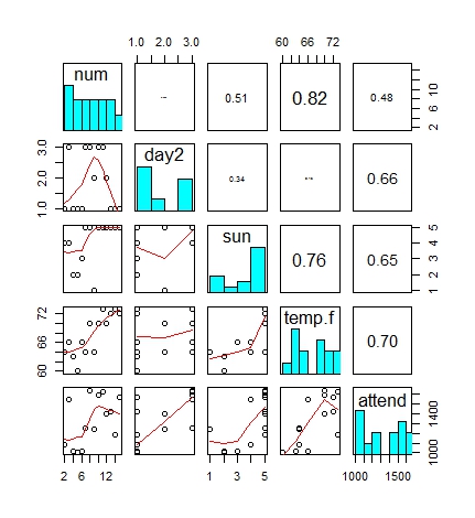
The "pairs" function used above creates a simple scatter plot matrix, with multiple X-Y plots comparing all of the variables that have been defined. While this is a quick way to visually check to see if there are any relationships, it is also possible to create a more complex scatter plot matrix, with the correlation coefficients and a histogram showing the distribution of each variable. (And to the histogram, I'll also add a loess trend line.) For exploratory data analysis, this is much more valuable.
# ######
# scatter plot matrix - with correlation coefficients
# define panels (copy-paste from the "pairs" help page)
panel.cor <- function(x, y, digits = 2, prefix = "", cex.cor, ...)
{
usr <- par("usr"); on.exit(par(usr))
par(usr = c(0, 1, 0, 1))
r <- abs(cor(x, y))
txt <- format(c(r, 0.123456789), digits = digits)[1]
txt <- paste0(prefix, txt)
if(missing(cex.cor)) cex.cor <- 0.8/strwidth(txt)
text(0.5, 0.5, txt, cex = cex.cor * r)
}
#
panel.hist <- function(x, ...)
{
usr <- par("usr"); on.exit(par(usr))
par(usr = c(usr[1:2], 0, 1.5) )
h <- hist(x, plot = FALSE)
breaks <- h$breaks; nB <- length(breaks)
y <- h$counts; y <- y/max(y)
rect(breaks[-nB], 0, breaks[-1], y, col = "cyan", ...)
}
#
pairs(HarbourCat.attend.data[,1:5], upper.panel = panel.cor,
diag.panel = panel.hist,
lower.panel = panel.smooth)
 |
| Fully loaded scatter plot matrix |
What we see from this plot is that attendance is most strongly correlated with temperature -- a correlation coefficient of 0.70. (Before you jump to any conclusions: did I mention the extremely small sample size?!?) There are also moderately strong correlations with the sunniness of the day, and whether the game was played mid-week, Sunday, or Friday/Saturday. In summary, attendance has been highest on warm days played on a Friday or Saturday evening, and on cool mid-week days have seen the lowest attendance. (Are we surprised by this?)
With more sunny warm weather in the forecast we can only hope that the correlation with attendance continues through the remainder of the season. The schedule looks favourable for high attendance, too -- they've got four mid-week games, three Sunday matinees (including the last game of the season), and six Friday-Saturday games.
When the season is concluded and more data points are added to the data set, I will revisit this analysis.
-30-


